It’s crazy to think that we’re already only about two months away from WWDC 2024. But here we are, and like everyone who gets hyped about this event, I can’t help but dream about what Apple might have in store for us with iOS, iPadOS, macOS, watchOS, tvOS, and now visionOS.
While there are plenty of other dreams I could talk about, there is one dream that has followed me through years of updates to macOS — and that dream is for the company to finally abandon the design ethos of iTunes for good and release a reimagined Apple Music app.
I’ve been an Apple Music user for years now. As a Spotify convert, I’ve seen the evolution of Apple Music since it launched back in 2015 to what it has become today. The experience has certainly improved in a ton of ways, from navigation to design, as well as a superior listening experience with both Lossless Audio and Spatial Audio. The Animated Art on the Now Playing screen is also much more beautiful on Apple Music than what Spotify offers.
I’d also argue that Apple Music’s iPhone, iPad, Apple Watch, and Apple TV apps are superior to what Spotify offers on those devices. However, there’s one device where Spotify currently destroys Apple in terms of a better app: the Mac.
Apple Music is languishing on the Mac
This isn’t even due to Spotify making a great Mac app for its music streaming app. While the app has certainly gone through some notable design updates and feels more modern, Spotify’s mission to pack music, podcasts, and audiobooks into one super-app has, at least for me, started to make the Mac app feel a bit cluttered. They’ve also tried to work some of the iPhone app’s redesign into the Mac app, making it feel even more chaotic.
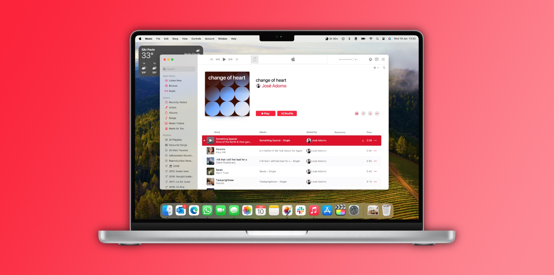
Where Spotify beats Apple Music on the Mac doesn’t have to do with how good the Spotify app is but the fact that Spotify has at least updated the app at all. The Apple Music app on the Mac has felt like the red-headed stepchild for the company — languishing with little attention paid to it. If you compare the Apple Music app on the Mac to the last version of the iTunes app, you won’t find a ton of differences in how you navigate or experience your music.
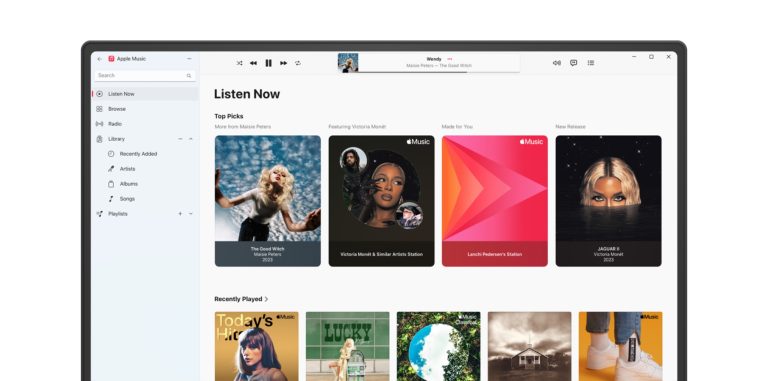
There’s at least one other person in the world who agrees with me. One user on Reddit posted last year, “I do not understand how everyone seems to be fine with the UI on Mac. It’s an absolutely horrendous design to have my library look like iTunes from the early 2000s while my playlist got the updated modern look. Is there something I am missing because I have not been able to find any mention of this?”
Agreed. Even this concept from years ago from artist Juanjo Guevara looks like a notable update since it at least has some ideas on how to reimagine that left sidebar.
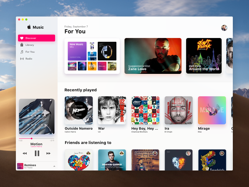
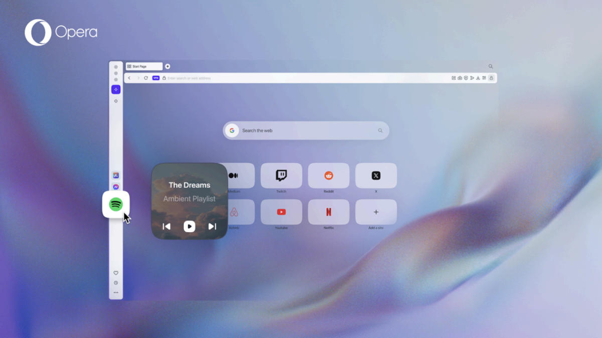
Apple has made such great strides with the music-listening experience on the iPhone and the iPad that the Mac deserves some risk-taking as well. Get nuts with it — go all-in on some dynamic widgets like Spotify is doing. In fact, just copy what Spotify is doing at this point…to a point. We don’t need clutter, just an app that resembles what Apple Music is today rather than what iTunes was.
Whatever happens, I just want Apple to try something. I get it — the Mac is probably one of the least-used devices when it comes to music listening compared to the iPhone and iPad, but that doesn’t mean it doesn’t deserve some TLC! We’ll find out for sure when Tim Cook and the team take the stage at WWDC 24 in June.


